Tuesday, February 17, 2009

Invisible Interfaces

Don Norman talked about the "Invisible Interface" and the "Invisible Computer" as one that the user expresses no thought effort on how to do the task, only on the task to be done.

In many interfaces, we learn what to do so that we don't have to think about how to do it. For example, driving a car. When we are first learning, it seems overwhelming: you have to look at the road, but you have to also watch your speed, but you should constantly check your mirrors, but pay attention to which foot is where, and keep both hands on the wheel, but be ready to shift at any moment. And the feet! By the time we learn, we don't think about all the steps necessary. We think about where we want to go, and we go. The interface with the car has become invisible.

There are common designs for many things in our lives. A toilet handle is, well, a handle. An HTML link is blue and has an underline. A submit button looks remarkably "button-y". A car's steering wheel is round and has little ridges on the back where our fingers fit. The important thing to remember is that these designs didn't start out that way. In any product, industry, and technology, there is a period where competing designs are tested and one dominant design wins out. Here is an example of a steering handle, a different design to a wheel.

When designers (or more usually, engineers or marketers) tinker with an existing design, alter it in some way, the design is no longer invisible. We have to think about how to do the task again. Try driving a car in a country that drives on the opposite side of the road from what you are used to. All of a sudden, you don't just point the car and go. Everything is on the "wrong" side, from the door locks to the gas pedal, never mind that ONCOMING BUS!

When we encounter a suddenly visible interface, it is jarring, disconcerting, and can prompt the phrase, "what were they thinking?" An example of this was a local watering hole who thought it would be cute to rename the labels on the bathrooms. Every bathroom was unisex, so it didn't matter what one was chosen.

They could have done a simple sign, like this, or this, or even a uniform look like this. But they didn't. Somebody chose the following:
  • Pointers
  • Setters
  • Democrats
  • Republicans
Suddenly, the interface is visible. Which one do you choose? You were focused on the task, whichever one you were going to do, and now you have to think. What if you choose incorrectly?

It is very frustrating to suddenly be confronted with something that is no longer invisible.

Of course, I could be a bathroom-phobe. What do you think?

Wednesday, February 11, 2009

Curious Perversions in Form Design

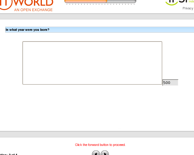
"The current estimated age of the universe is only in the tens of the billions," writes Bob S, "so twelve digits or so for the 'year you were born' field should have been adequate to accommodate the return of the Old Ones, should they be interested in filling out readership surveys. iPerceptions wanted to play it a little safer, though."


http://thedailywtf.com/Articles/The-Littering-ATM.aspx


Umm... I agree. But what do you think?

One Simple Thing

The only way to really beat the system at a casino is to get "comps" for as many things as possible, while gambling as little as possible. Most books you could read send this same message. All casino games are "negative expectation" games. That is, the statistics are engineering in the house's favor. The best you can do is minimize your losses and enjoy the perks.

The only way to get "comps" at the table games is to ask for them. Table games are Poker, BlackJack, and Roulette. (Yes, I know there are variations of these, like "Spanish 21" or "Carribean Stud", but those are even more negative expectation, and I never play them). These days, every casino has a "frequent flyer" card where they can swipe you into the system, keep track of how much you play, and award you "comps" based on how much you win (or really, lose).

So, there I was in Atlantic City, asking to be comped a meal. There was a pit boss there, using the compter. First they granted me the comp for breakfast at the buffet. Then it turns out there is no buffet breakfast on Sunday. So, they needed to issue me a refund/cancellation and then issue me a new comp based on the restaurant that was open.

It took 20 minutes.

It turns out that the pit boss was from a Blackjack pit, and they use a different computer system for the Poker pit. He kept trying to enter his identification to issue the refund, and it was refusing. Finally, he came up with the idea of putting his initials instead of his employee number in the field. It took, and they were able to issue me the comp.

Some key questions came up:
1) what error message was he getting, and why wasn't it giving him enough information to figure out what needed to be resolved?
2) what was the label on the field that could take his employee id or his initials, and he couldn't tell the difference?
3) Why didn't the comp system know that the buffet was closed?
4) WHY HAVE DIFFERENT COMP SYSTEMS 150 FEET APART?

Simple, simple usability issues that caused both the pit boss and I frustration and led the casino to lose money. Why? Because they know how much money they make from me when I gamble for 20 minutes. That 20 minutes standing there was lost revenue.

But, I'm just frustrated with the experience. What do you think?

Tuesday, February 10, 2009

Montgomery Scott School of Project Management

I read about this somewhere, and a typical google search turned up only vague references to it. So, here it is, for others to link to.

The Montgomery Scott School of Project Management
First, the background...
For those of you who don't know, Star Trek started as a television show in the late 1960's and became a cultural phenomenon. It spawned 5 spin-off series and about a dozen movies. The "original series" takes place on the Starship Enterprise, and Montgomery Scott (aka "Scotty") was the chief engineer on the ship.

It seemed like each week, there was some crisis and a conversation something like the following would occur:
Captain: Scotty! We need the warp drives back on line! We need to escape!
Scotty: I canna do it, Cap'n. The drives are shot. They canna be fixed.
Captain: Scotty! If you don't do it, the Caldrassian Empire will be eliminated!
Scotty: I'll see what I can do, but it'll be several hours at least.
Captain: Well, keep me updated! We need to have that power!

Scotty: Cap'n, the warp drives are back online.
Captain: Bless you, Scotty! Navigator, Full Warp Speed!

This particular example was repeated over and over, and even became somewhat of a joke. However, from this exchange, we can infer the guiding principles of the Montgomery Scott School of Project Management:
  1. When the client asks for a new project, even when the specs are clear, deny the possibility of the task being able to be accomplished. The odds of completion are so astronomical as to defy description.
  2. If pressed, multiply by 4 (or 8) the amount of time you think it might take.
  3. When it only takes you twice as much time as you originally estimate, you will come out ahead by a factor of two (or four).
I have only used this once or twice, and believe me, it works.

Quote from Montgomery Scott, later in his career:
How are you going to get a reputation as a miracle worker if you tell the Captain the actual amount of time it will take?!?!
Hopefully, this will rise in the google rankings, so others can benefit.

Friday, January 16, 2009

Selling Experience

I've noticed over the years that there is an interesting dichotomy in the style of advertising coming from really large, really competitive companies. And this style repeats in a couple of different industries:
  • Pepsi vs Coke
  • Burger King McDonald's
  • Universal Studios vs DisneyWorld/Land
In each case, the one on the right is significantly more dominant in their market than the one on the left (of course, the one on the left doesn't like to admit it). Coke outsells Pepsi 2 to 1.* ~14000 McDonald's to ~7700 Burger Kings. ~116 million visitors (worldwide) to 26.4 million (worldwide)

This is lopsided market share is not anywhere more evident than in their advertising. Here are some of the slogans & ideas they have each used:
  • Better Tasting/Choice of a New Generation/Something for Everyone
    vs
    Have a Coke and a Smile/I'd like to buy the world a Coke and fill it with love
  • Our fries are better/Flame broiled burgers are healthier (?) or better tasting
    vs
    Happy Meals/I'm Lovin it/You Deserve a Break today/We love to see you smile
  • Better Rides/More Rides/Faster Rides/More Trills/Better Shows
    vs
    Magic Kingdom/Where Magic Lives/The Magical Place to Be
So, what are they selling? One side sells Soda/Pop/Drinks, Burgers, and Rides. The other sells Smiles, Happiness, and Magic.

It is a powerful message.

The fact that their drink does better in blind taste tests, or that some tribe from the Arctic (who has never seen cows) likes their burgers, or that people like their rides better are all product features. The other side is selling the experience.

So, when selling against competitors, what are you pushing? Do you point out features? Or do you sell experience?

What do you think?

* ok, so I don't have a source for this. And those who know me will understand that I'm biased. So, if you dispute this number, go find a better one and post it here. I'll correct.

Thursday, January 15, 2009

It's the Simple Things

So, Amazon.com is the world's leader in usability. They test everything, and retest, and retest. I've known places that all they want to do is emulate Amazon. A friend told me about his boss who:
  • printed out the Amazon homepage
  • crossed out the Amazon logo
  • wrote in their company's name
  • handed it to my friend and said: "Make this!"
So what happens when Amazon gets it wrong?

I could be going off on a rant here (to quote Dennis Miller), but they do so many things so well, why can't they have a login that just logs you in? Since so much of the experience is about your previous shopping at Amazon, every page/screen/section has something to do with you and your history. But you can't just log in.

Blogger has a log in. It is in the upper left of the window. That one, up there. On this screen.

Some sites, the login is all you can do. Take Penn's implementation of Zimbra, for example. Just a login.

Josh Porter (and others) talk about inviting your users in, teasing them with the premise of the site and getting you to log in. They point to sites like LinkedIn, Geni, and others. But on all those sites, you can click a link to log in.

Amazon has a "click this link to log in" link, along the top (along with a "Hello" that turns into a "Hello, Consuela" after you log in). But you'll notice that the link says "Personalized Recommendations" and thats where you go after you log in. There's also a "My Account" link, but how can it be My Account when I haven't logged in yet?

It seems like a minor point, but it irritates me every time I go.

What do you think?

Thursday, January 8, 2009

Setting Usability Criteria to Guide Development

There can be amazing value in setting usability targets before you design the application. This technique may not work in all environments and all projects, but shoot if it didn't work really well here. Note: a lot of the ideas from this post come from Luke Wroblewski's amazing insights into Best Practices in Form Design. If you haven't see Luke speak, see him. If you haven't read his book, buy it now.

So what is a usability target?

In a usability test, you generally record some metrics of user behaviour. Sure, you can ask people, "Did you like this site?" or "What did you think of the colors?" but you aren't really measuring anything there. The issue is that even if you aggregate reactions of this nature and say
respondents gave a 3.75 on a 5 point scale to this
website when asked if they liked the site or not

how do you you improve that 3.75? Should you improve that 3.75? Name 5 things you could do to improve that 3.75. Who can? I couldn't. Maybe put some puppies. People like puppies.

However, if you were to say things like:
  • 67% of participants failed to find the "Purchase" button
  • the average time to complete the transaction was 13 minutes and 15 seconds
  • 98% of respondents didn't look beyond the homepage
Now we're talkin'. You can develop a plan to raise (or lower) metrics like these. If you made the purchase button 30% bigger, I bet more people would find it. If you removed some steps from the checkout process, you could probably complete transactions faster. And so on.

Important note: I wouldn't suggest any value judgement on any of these numbers. While 67% failed to find the button, 33% succeeded in finding the button. Maybe 33% is a great number. Maybe your business couldn't handle if 99% found it. The point is that the metrics give you a place to start the discussion.

Crazy Idea
try this on for size: what if you set the goals before you even designed the site or app? What if the metrics were clearly established as part of the requirements?

That's exactly what we did in the faculty recruitment project. Everyone on the team knew the basic requirements:
  • build an online application for collecting applicants to faculty positions
  • deliver faculty applicant's data to hiring officers electronically
  • be publicly accessible but store the data securely
some basic requirements, right? What we did as a team was to set some additional usability targets:
  • Applicants must be able to complete the form in 90 seconds or less.
  • Once an application is started, Completion rate must be near or above 99%.
  • No logins or passwords that would prevent the application from being completed on behalf of the applicant by someone else.
These targets were set based on our understanding of our user pool, potential faculty at Ivy League institutions. And most of them would be physicians and surgeons. These users are not universally known for their patience and forbearance. Actually, they tend to be a very demanding group.

Given that we had these targets to achieve, many issues that could have otherwise been thorny fell into place quickly.
  • Wherever possible, eliminate fields. All the data on whether or not you want to hire someone is in the resume/CV anyway, so no sense in asking the user to input their entire CV over again. Only display the minimum number of fields that are needed.
  • Wherever possible, eliminate non-required fields. If they really, really aren't required, why are we asking them? Apart from data in the CV, there are data you could ask that would be nice to have, but are really needed. Get 'em out.
  • Eliminate steps. People can scroll down. People do scroll down. If you make it obvious that they need to scroll, and there is content or ideas to see down there, they'll scroll. No need to add clicks & steps unnecessarily.
  • Make flow of application obvious.
  • Group like fields together
  • Delete unnecessary text
  • Make labels clearer (especially if you could add a word or two to make the intent clear)
  • Make field sizes appropriate to the text they will store.
It became liberating, in a way, to have these constraints in place. Because it gave us a reason to say "No" to something. It also made decisions easy when it came to should we do it like X or like Y? If the decision impacted our usability issues, then pick the best one. If not, then it doesn't matter. The programmer can decide.

The end result is here:
http://www.med.upenn.edu/apps/faculty_ad/index.php/g303

Try clicking on an posting and then click "Apply for this position"

Tell me what you think.
Tuesday, January 6, 2009

Usability that Sucks

I know, Jared Spool loves to talk about the "Scent of Information" or about content that sucks the reader/viewer in, but sometimes a site sucks. "Sucks" as in, FUBAR, crappy, poorly executed, stupid, inane, insipid, lazy... I could go on.

Here is an example of one, the FBI Jobs website. Assuming they are going to change it at some point, here is a picture of the search screen:

What's wrong:
  • three different navigation actions
  • some fields whose labels are hard to read
  • the fields are probably required but unlabeled as such
  • some additional radio buttons that are cryptic, especially to a new visitor
  • an INSANE amount of red text
Just a few items, there are more. Look, I know that the developers of this site were under government contract and probably had 300+ pages of requirements and specifications, but come on! It is confusing as hell!

Here is the kicker:
I, not really applying for an FBI job but vaguely interested, clicked on the "Just Browsing" radio button and got this:
An unspecific error with no direction on what to do next. *sigh*

So, what are some remedies?
1) split the initial navigation into links: Just Browsing, New Users, Registered Users
2) if you want to get all Web2.0-ish, you could have the additional information needed for registered users display once they click the Registered Users link. Or you could just go to a new screen
3) the Please Note at the bottom should be color reversed (Please Note in red, paragraph below in black)
4) Since you probably can't change or lessen the number of words in the bottom Please Note paragraph (it cites US Code title & section), I'd remove it from the screen. I mean, if I am truly just browsing, aren't I not worried about falsifying information? Honestly, this paragraph probably needs to be put in the face of registering users and anyone who is about to submit an application for a specific job. Otherwise, it isn't necessary.
5) The Please Note at the top, change to a link that says: Important Note if you registered in our system prior to 2/22/2008. I can quickly judge if it applies to me, and if not, I can ignore it. If it does apply, I can click on it to see the important note.

you can see a revision here
IMPORTANT NOTE: only the registered users link works. Don't click anything else unless you want to apply for an FBI job.
Hey! These important notes are fun!

This revision took me ~15 minutes. Maybe less. And it looks a heck of a lot better.

But these are just my thoughts. what is your reaction?

Just Starting out

So, after much hemming and hawing (several years of it), I have finally been convinced to start a blog.
Things I care passionately about:
  • Usability and User Experience
  • Leadership & Management
  • Customer Service
  • Football - especially one Philadelphia Eagles
So, I'm going to start this, and keep focused on those topics. The ultimate, crass intent is to write a book, and this seems like a way to get going on it.

Please PLEASE correct me. I need it.